Book cover disigns.
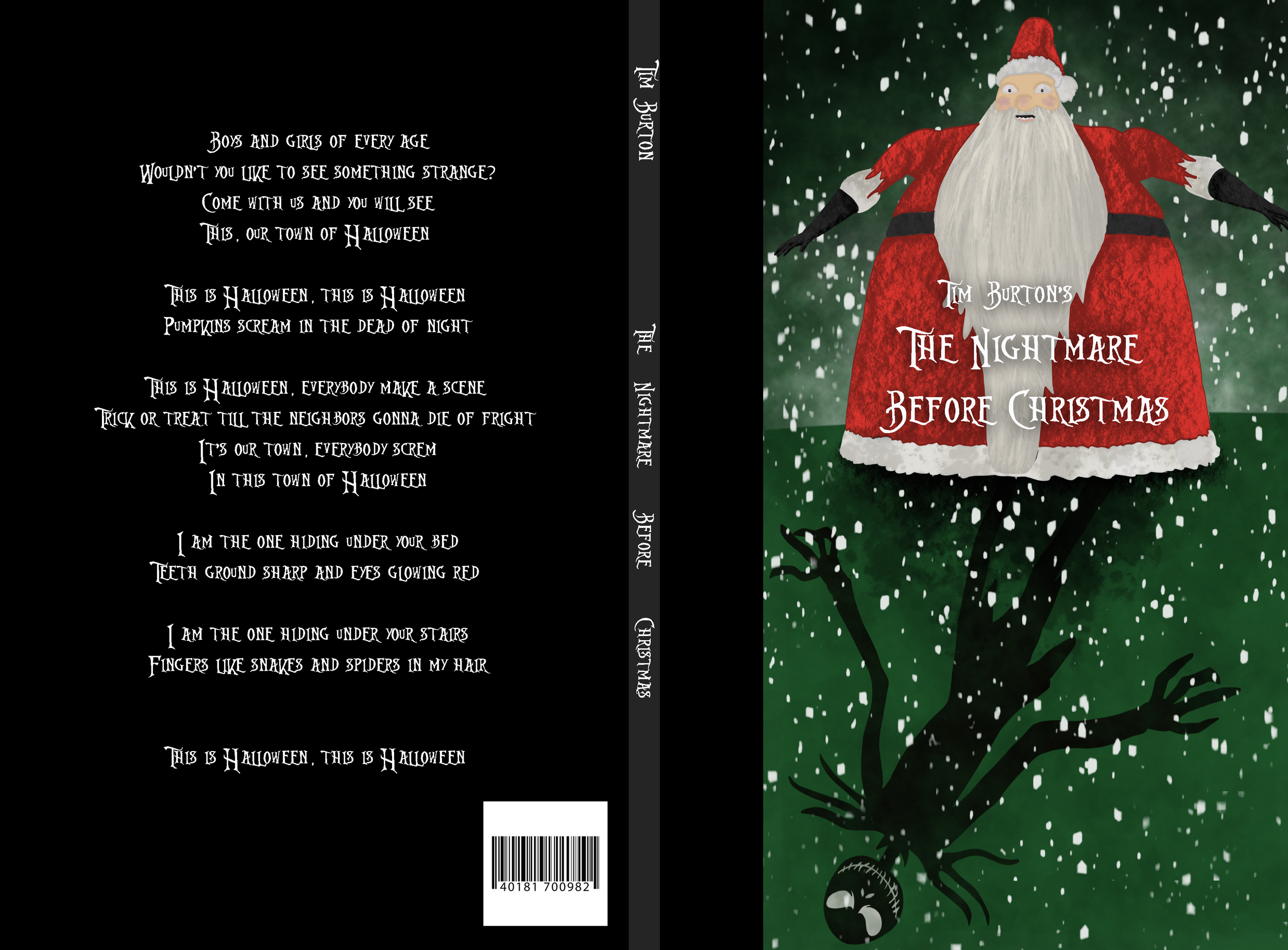
For my second design, I decided to focus more on the elements of hierarchy. Starting with a startled Santa the viewer makes their way down to the text and then to a mischievous Jack Skellington shadow. What I love about this design is how I was able to take Tim Burton’s characters and unify them into a setting where I could play with emphasis and proportion. This one is my favorite design of the three because I really enjoy how my illustration turned out.
Version two.
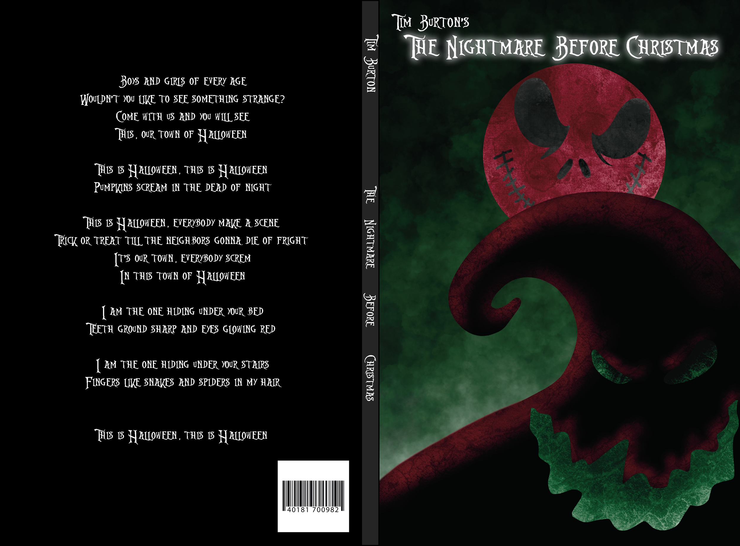
My take on a favorite.
I love movies, especially ones from my childhood. As it happens, there are books available for most movies and so I thought it would be a neat idea to design some book covers for one of my favorite movies, The Nightmare Before Christmas by Tim Burton. I chose to do three different designs, each showcasing my ability to use different elements and principles of design.
In each design, I worked in both Procreate and Adobe Illustrator. For this first design, I used complementary colors of red and green which also play well for the whole Christmas theme since those are typically connected to the holiday. I also used the negative space to pull in dual imagery. You can see the main character Jack’s face in the shape of the moon as well as the villain, Oogie Boogie, inside of the iconic hillside.
Version 3.
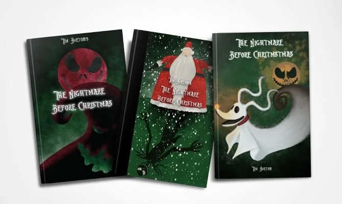
Somewhat similar to the first design, I have used continuity to make one object blend into another. The ghost dog, Zero, has a tail that turns into the hillside with Jack-in-the-moon hovering overhead. There is some sense of hierarchy here as the eye follows from Jack to the tip of Zero’s nose. Going more with Halloween colors, I used the compliments of green and orange to help emphasize areas of the design. Looking back, I would probably do away with Jack’s moon face and substitute a silhouette of him and possibly another character, Sally, however, I still think this works.
Final pieces.
This self-prescribed project was a favorite of mine because I was able to have fun illustrating while also reinforcing the design concepts I had learned. Some challenges I faced were taking my illustrations in Procreate and uploading them into Adobe Illustrator to then be applied to book cover layouts. If I could change one thing it would probably be my choice of typeface for the back cover. I think that would have been better suited with a more readable pairing to go along with the title type.


