

New Life Fashion.
To identify what services could be offered to help support this effort, I conducted secondary research to learn more about the clothing industry. I found that most tailoring shops offered some of the services that I wanted to include, as well as some dry cleaners. What I didn’t find was a one-stop shop for everything clothing upcycling. So in addition to tailoring and dry-cleaning services, I also thought it would be beneficial to have a service that helped with faded clothes that needed re-coloring. Last, I considered my upbringing and hand-me-downs I remember not fitting quite as well on me as they had their original owner. So my last station was decidedly for measurements and sizing.

Research.
It is not a secret that global warming is causing many of us to consider how we impact our world and the carbon footprint we each leave behind. The fashion industry produces up to 10% of humanity’s carbon emissions, dries up water sources, and pollutes our rivers and streams. What’s more, my research shows that 85% of all textiles go to the dump each year (UNECE, 2018). With all this waste and pollution, I started to consider how fashion might be recycled to reduce the amount of waste and pollution by reusing old, worn-out clothes.
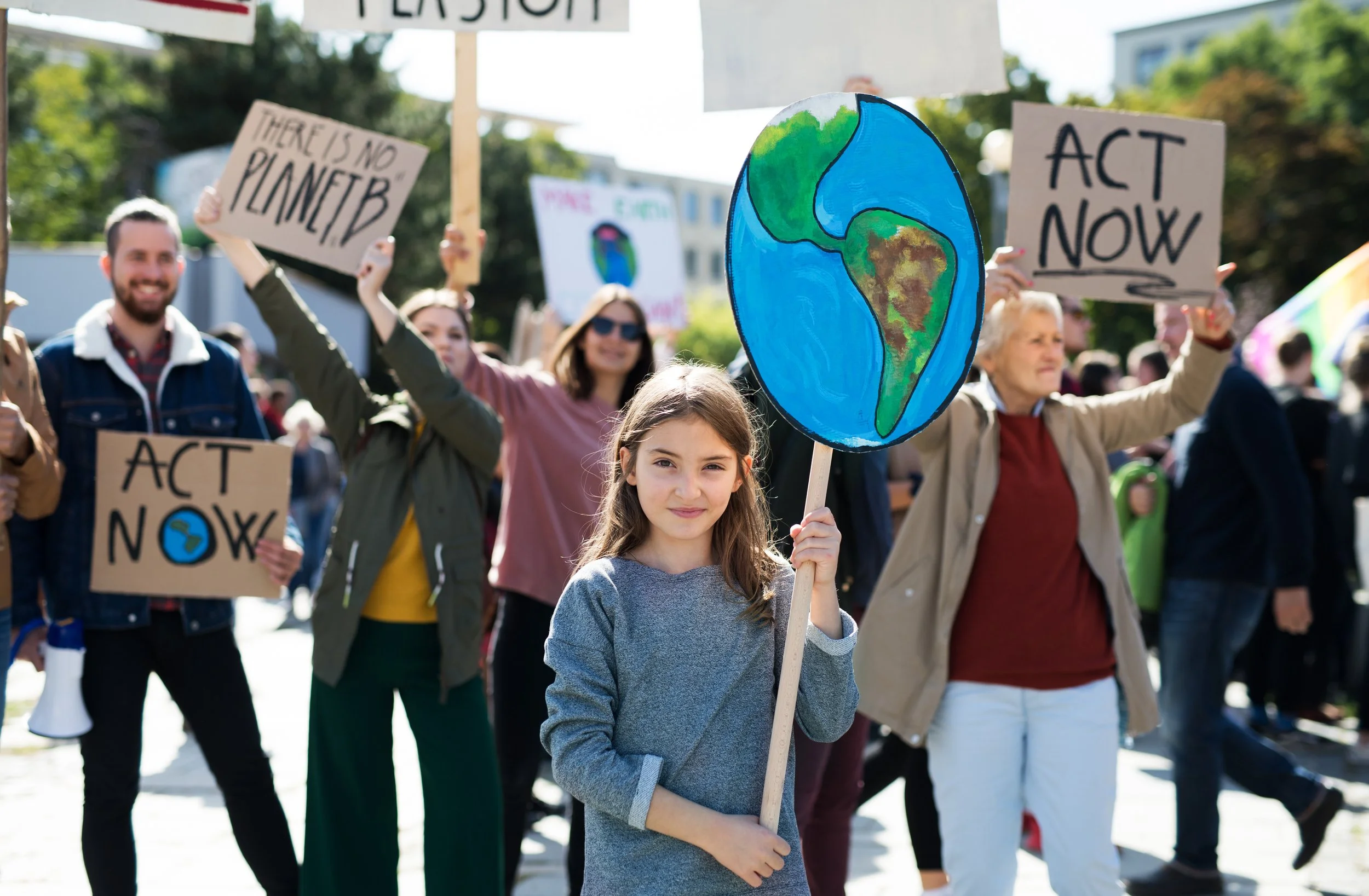
A global crisis.
Ultimately, the symbol concept that stuck out the most to me was the scissors and butterfly combination. I took to Adobe Illustrator and drew versions of both and then worked to combine them in a way that unified the two constructs but also afforded balance and strong contrast.
Symbol refinement.
Now that I had a clearer idea of what I wanted to gear my project toward, I began to brainstorm symbology around the ideas of fashion, new life, restoration, and sustainability. In this stage, I conducted further secondary research on the meaning of various symbols. I learned that the scarab beetle is an ancient Egyptian symbol for rebirth and that the starfish coveys regeneration because when they lose a limb, one will grow back in its place. While those were important in my process to learn about, I didn’t feel that they suited the direction I wanted to go. Instead, I found that my strongest sketches were the clothing images with arrows inferring the recycling process and the butterfly and scissors combining transformation and fashion.
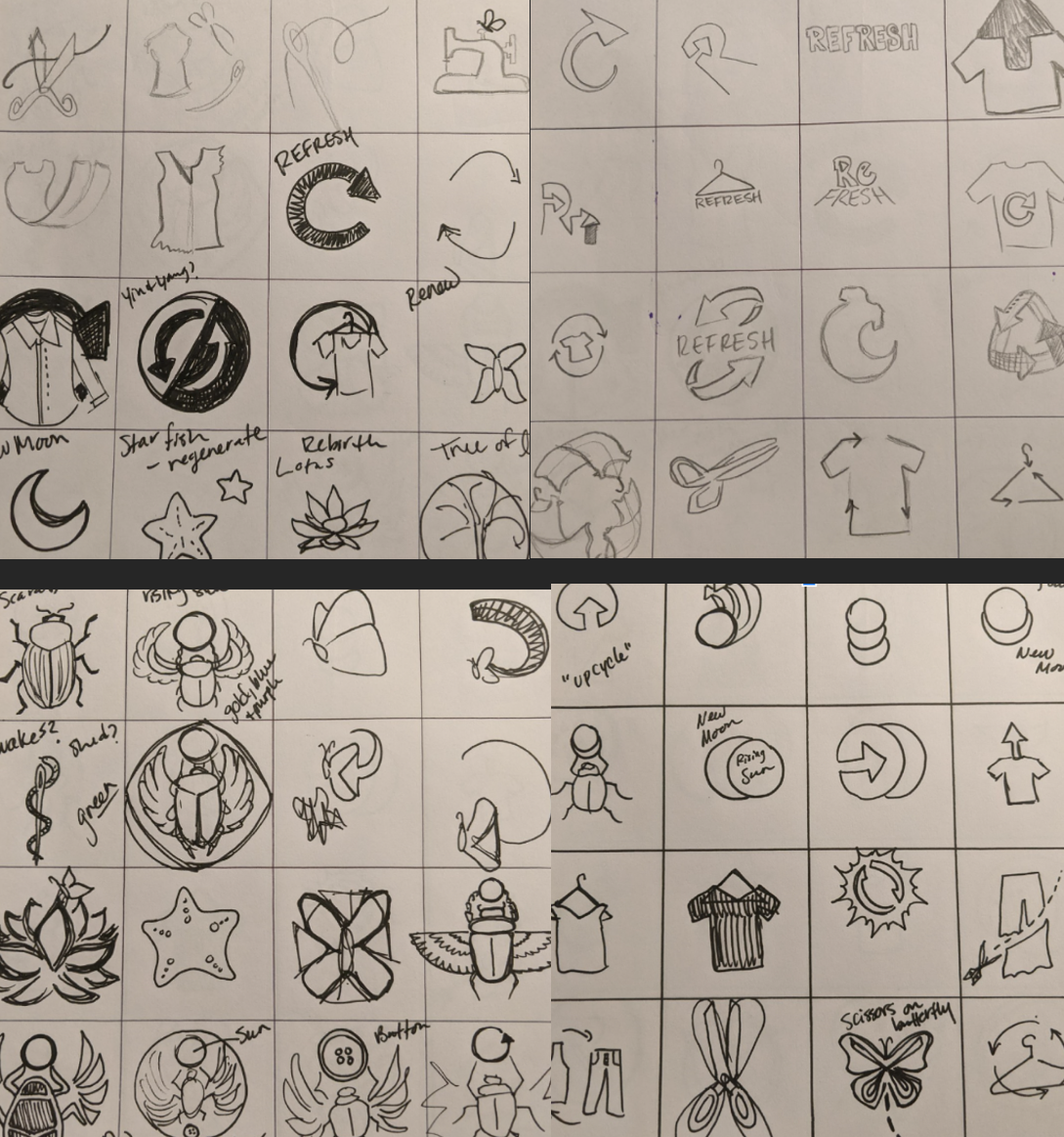
Symbol sketches.
With my logo finalized, I then moved on to research what sort of assets my store might need. Since most businesses offer online services, I considered adding my logo to a mailer bag so that their clothes could be shipped to and from the store for refreshing. I also wanted the option to go into the store to pick up your items so I also added the logo to a hanger for dry-cleaning, a business tag, and a recycled paper bag.

Assets.
Once I had designed the symbol for the logo, I listed off some potential names for my fictitious business. Ultimately, I decided on New Life Fashion because I felt that helped tie in the concepts of transformation that we get from the butterfly and scissors. For my typeface, I used Uberhand Text Pro because I felt that a san-serif font would speak to a more modern vibe, and the stroke weight allowed for up-and-down scaling with little loss in image quality. I wanted the text to feel unified with the symbol more, so I modified the word “life” and adjusted the ‘i’ to have a butterfly-scissors symbol as well.

Logo.


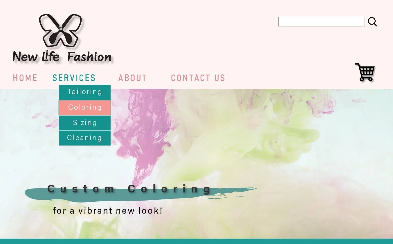
Taking to Adobe Indesign, I set to create a page for the Home tab and Services pages. My goal was to design a systemic look and navigation system that remained the same as users traveled from page to page. This is one of the first drafts of part of the Custom Coloring page. I found that too much resided below the fold and went back to the dawing board.
Pages.
For customers to be able to place orders online, I also needed to develop a website design. I decided to focus on an About page as well as Services and Contact Us. This is an example of information architecture I mapped in Adobe Illustrator.
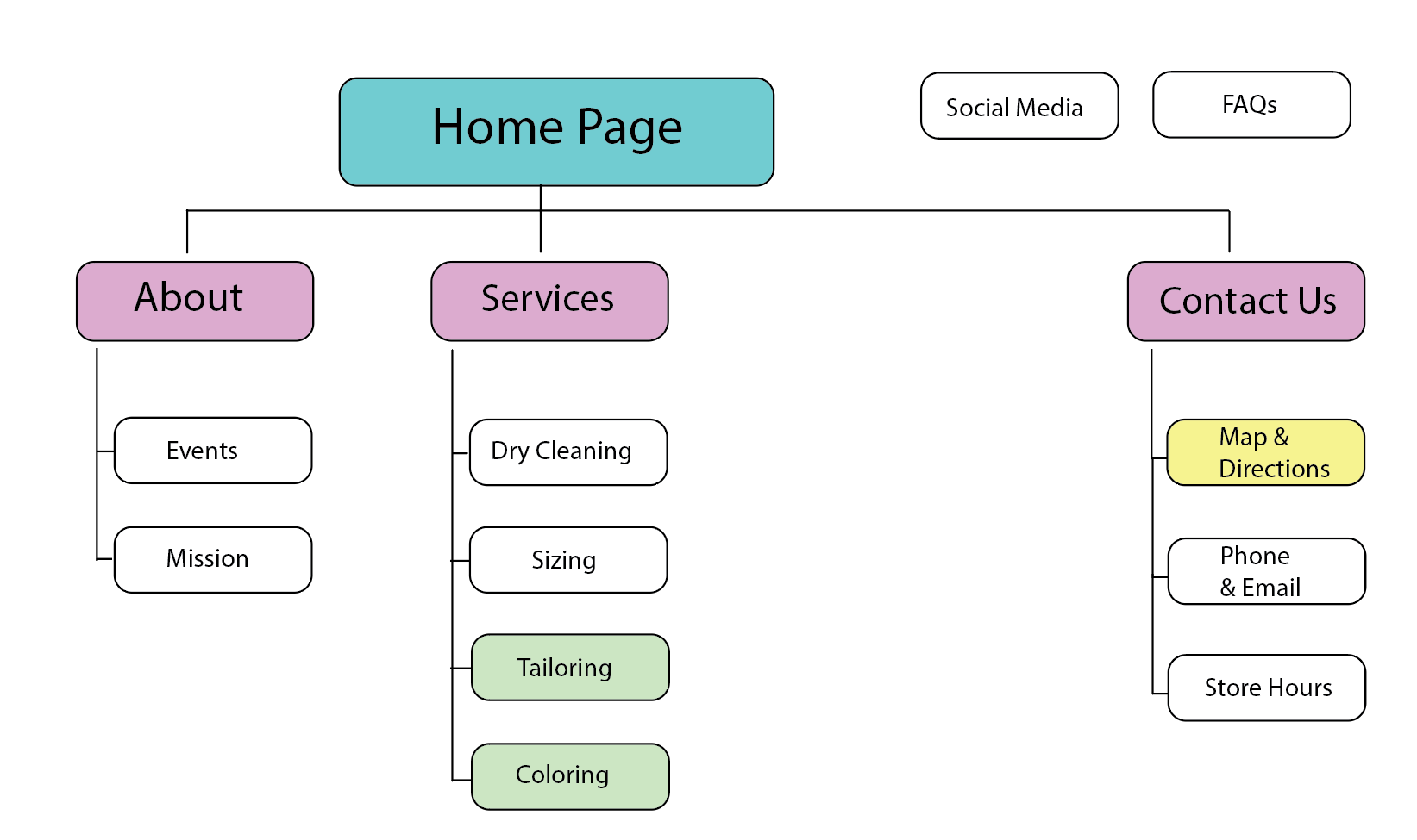
Website development.
When considering how I would format my pages, I realized many users would likely be visiting the site from their phones. This led me to alter my layout for a more mobile-friendly design. Through user testing in Marvel, I learned that some of the functions I had set up did not work as expected. I also worked to align my various sections so that they remained the same size as the user navigated from page to page. I found that this helped users feel more comfortable and the feedback turned from a bit jumpy, to smooth and easy to navigate.

Responsive design.
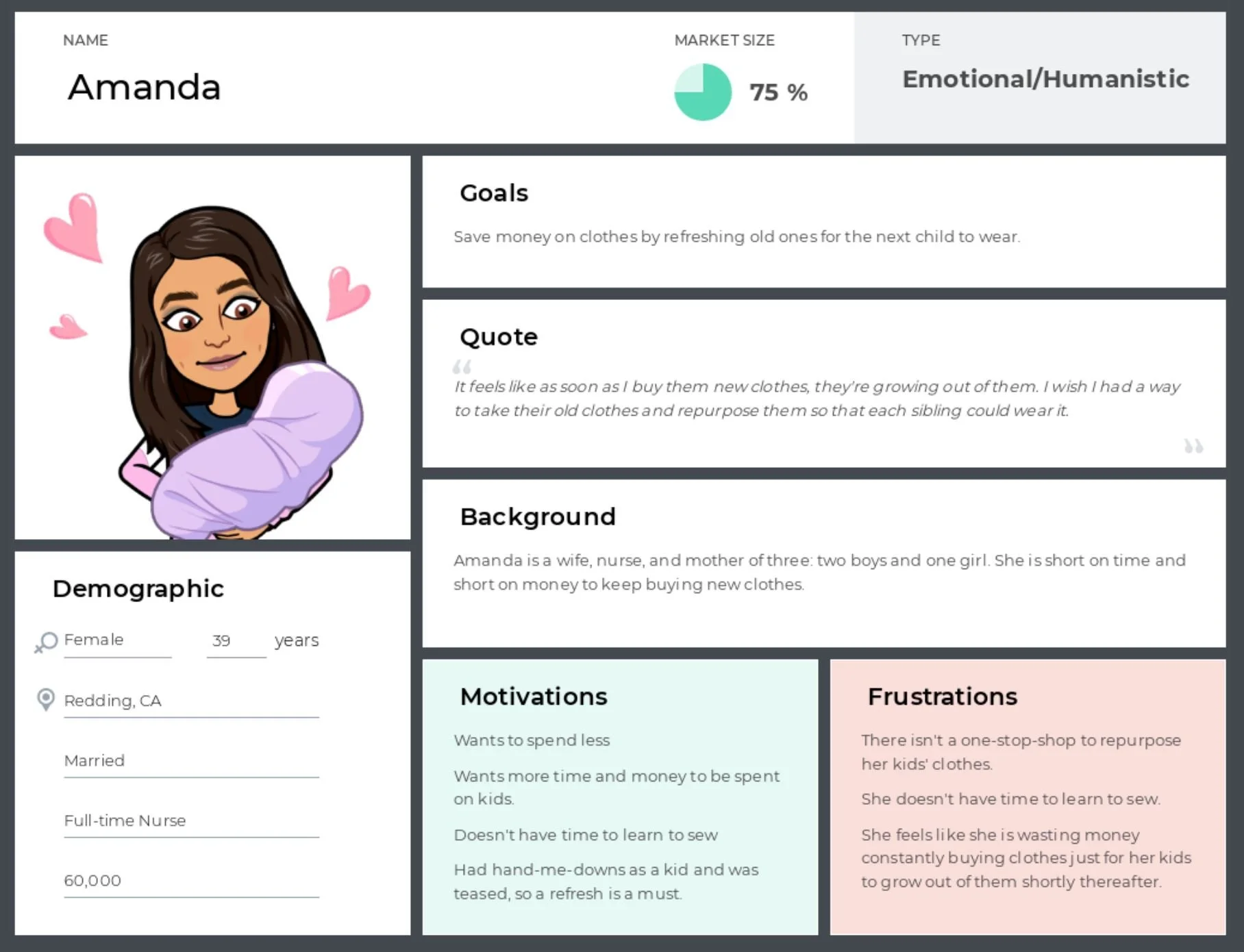
Also, while designing my site layout I needed to consider who my users would be. That is why I created a user persona and focused on what would motivate them to use the services we offer as well as some information on her background and current frustrations. This allowed me to take on another perspective when it came time for user testing.
User persona.
Challenges & Learnings
A challenge I faced in this project was learning a new prototyping tool, Marvel, that I mentioned when I discussed user testing. While it is pretty user-friendly, I had to learn how to navigate it and how to create a way to have a functioning menu drop-down from services. Through trial and determination, I was able to make the menu bar toggle to different colors when you hover over the different menu options. This was also a big win for me and once I accomplished that goal, connecting the rest of the pages and button features was easy.