

Brand Design for the
California Department of Corrections & Rehabilitation

In-house logo design.
In June of 2022, I was hired by Chico State University as a graphic designer to work with the California Department of Corrections and Rehabilitation, specifically their recruitment department. Over the course of a year, I designed several assets for them, beginning with a logo for the Peace Officer Recruitment Unit (PORU). Adhering to their branding guidelines, I used their color pallet to create a unique logo to represent their unit. To the left, you can see some of my initial sketch ideas for the logo design as well as their state seal and badge logo which I used for inspiration.

Refining the logo.
Once approved, I moved forward with the logo design that best fits the Peace Officer Recruitment Unit. The logo went through a few stages of variations in which I offered different versions based on color and size. The digitally rendered iterations to your right were designed in Adobe Illustrator. I played around with the dimensional quality of the designs by adding elements to have the logo pop out more three-dimensionally, as well as leaving some flat for a different aesthetic.

Final Logo.
To the left is the final logo design chosen by the PORU team. The logo needed to represent inclusivity and diversity. I worked with their color palettes and created silhouettes that were ethnically different as well as diverse based on gender. Since I chose to use one female silhouette, I chose to have her as the center image as well as the largest of the three. For the star symbol, I used the CDCR badge for reference and repeated the symbol on the outer circle. The flat, stamp-like quality of this logo works well for print and digital formats, it can be sized up or sized down and they currently use it with their email signature line.

Recruitment Business Cards.
During the process of designing various business cards for the recruitment team, they mentioned that I did not have to comply strictly with the branding guideline colors. I decided to play with brighter greens and yellows, and I also found that I was drawn to the chevron symbols on the officer uniforms. I played with those shapes as well as a softer corner which I felt resembled the points of the officer badges. Using repetition, I created direction and movement within each design.

Final Business Card.
Ultimately, this option was chosen for the final business card design. This design uses their branding guideline colors as well as their main logos (State Seal and Badge) for the California Department of Corrections and Rehabilitation. For the front, I went with predominantly dark grey and used the opposite color variation for the back of the card. Moving forward, I continue to use these shapes and colors to help create a cohesive set of assets.
Presentation Template.
Please view the video to your right to see the full template created for PowerPoint as well as hear my thoughts on the design process and requirements.
Physical Fitness Test Booklet.
For new officer recruits, the California Department of Corrections and Rehabilitation has a physical test that cadets need to pass in order to qualify for the job. In order to help prepare them for the test, they have a PFT Booklet they hand out which helps the cadets to get ready. Sadly, their booklet was pretty outdated and they asked for me to re-design it. On the left, you can see a short video of the original booklet.
Final PFT Booklet Design.
Using the same design elements, I created a more modern-looking booklet for the recruitment department using Adobe Illustrator and InDesign. Using leading lines, repetition of shape, and typeface, this booklet came together nicely as one cohesive unit. Please watch the video to your right to hear more of my thoughts regarding my design process.
Click the link to the right to view a digital version of the booklet.
PORU Newsletter Template
The Peace Officer Recruitment Unit prioritizes sharing information and updates on the happenings within the company. To assist with not only making it easier for them to compile newsletters but also to have their newsletters fit their new aesthetic, my next task was to design a cohesive template for them to use. Their request was to be able to use the template in Microsoft PowerPoint, so I created the template in Adobe Illustrator and then exported it to PDF, and from there I was able to export it as a PowerPoint Presentation.
Meeting Agenda Template
To keep in alignment with the new graphics I created thus far, the recruitment team also asked for a template for their meeting agenda. Once again, I created the template in Adobe Illustrator and then exported it to PDF, and from there I exported it to Microsoft PowerPoint for easy access editing. Please view the video to the right for an example of their previous agenda template as well as to view my final design.
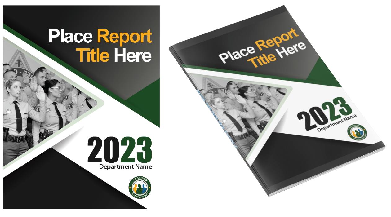
PORU Report Cover
Using the same color palettes and shapes, I created a report cover page for the Office of Peace Officer Selection. This cover is interesting because it contains a few different layers of patterns as well as I mixed up the color of the text. This template is editable in PDF and Microsoft PowerPoint where they can easily swap out the type and the image to something new.


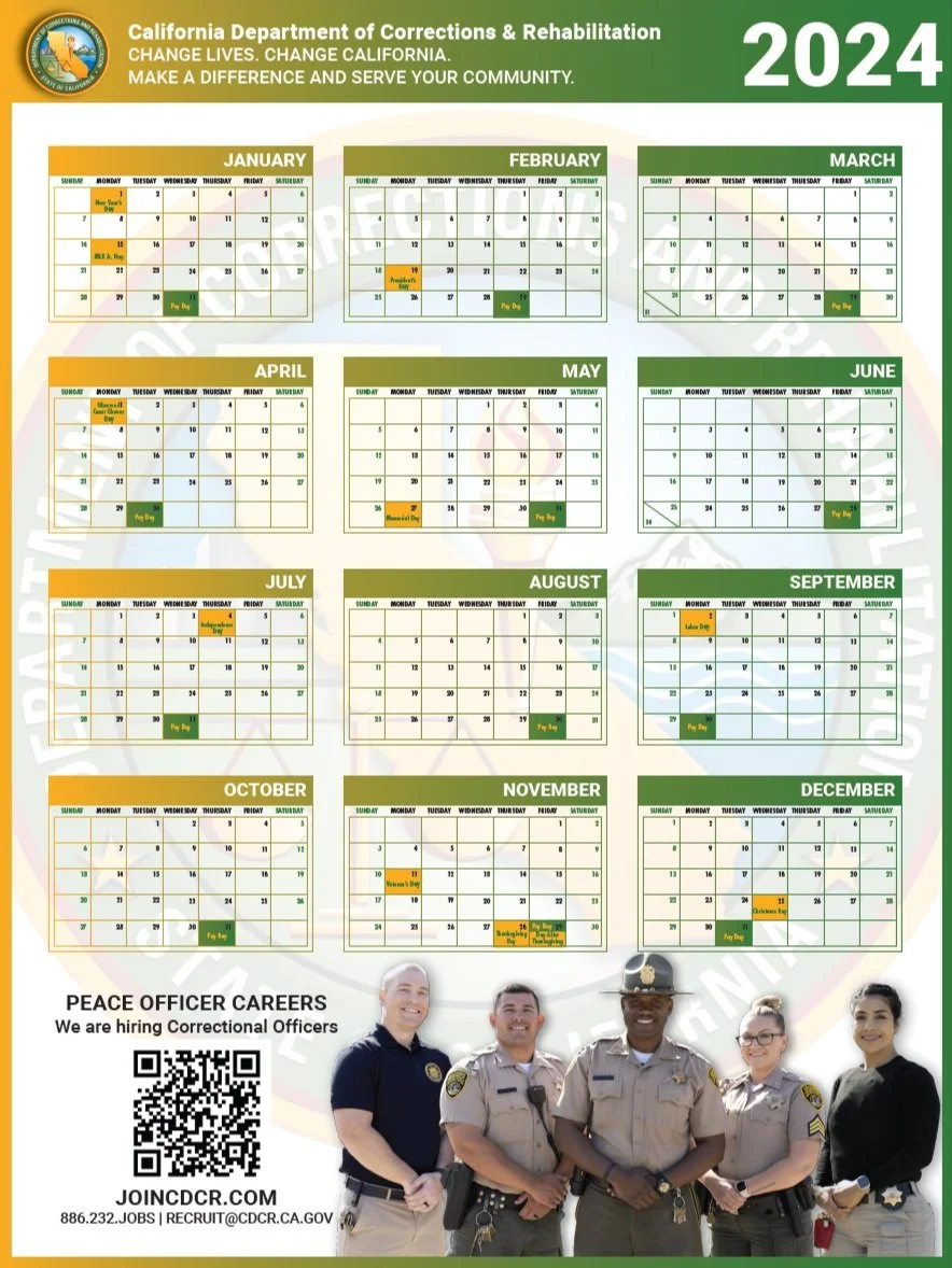
CDCR Annual Calendar
After meeting with the recruitment team to discuss their wishes for the calendar, it was clear that they wanted an updated, less used image (the one they currently have been using is perhaps almost over-used) and the images would be supplied to me by another vendor. The calendar needed to be formatted for print and available in two sizes: 18” x 24” and 9” x 12”. The first round of discussions resulted in a change of gradient pattern for the mini calendars as well and they informed me that the image I chose was chosen by another vendor to use so they needed me to change the image.
I worked with the team and offered a few solutions to this problem since they needed me to change the image. First, I could bring my camera equipment with me and take images at a location of their choosing. Second, I offered to use stock images with which they could purchase the license however, that might not be exactly what they want. Or, last, they could do a re-shoot and I could select a similar image to replace the current one.


Updates
As it happened, the team was already planning another photoshoot that week with different officers so they decided to have me wait until they were able to share those images with me. The updated design includes a composite of two images, formatted and digitally altered in Adobe Photoshop. As you can see, I changed the gradient as well to have the mini calendars match the change in gradient with the border. These two versions are currently being reviewed and one will be chosen as the final design.
Final Calendar
After a few changes and one correction, we have a winner! I’m excited to share the final calendar for the California Department of Corrections and Rehabilitation for 2024. To help the paydays stand out, I added a green background and changed the type to yellow. The gentleman on the far left was also out of regulation for his uniform, so they gave me some images of a badge they wanted me to photoshop onto the left chest side of his shirt, as you can see.
They also had a few changes for the location of their paydays, so I made those adjustments and changed Cesar Chavez Day to “Observed Cesar Chavez Day” and relocated it to April 1st. Since the paydays for March and June no longer needed to be crammed into the last day of the month slots, I removed the background for those and changed the dividing lines to diagonals which I think is a more familiar way to view a calendar.
This calendar will be shared throughout the state of California and will be made available in 9 in. x 12 in. and 18 in. x 24 in.