

Event Sign-up for Mobile
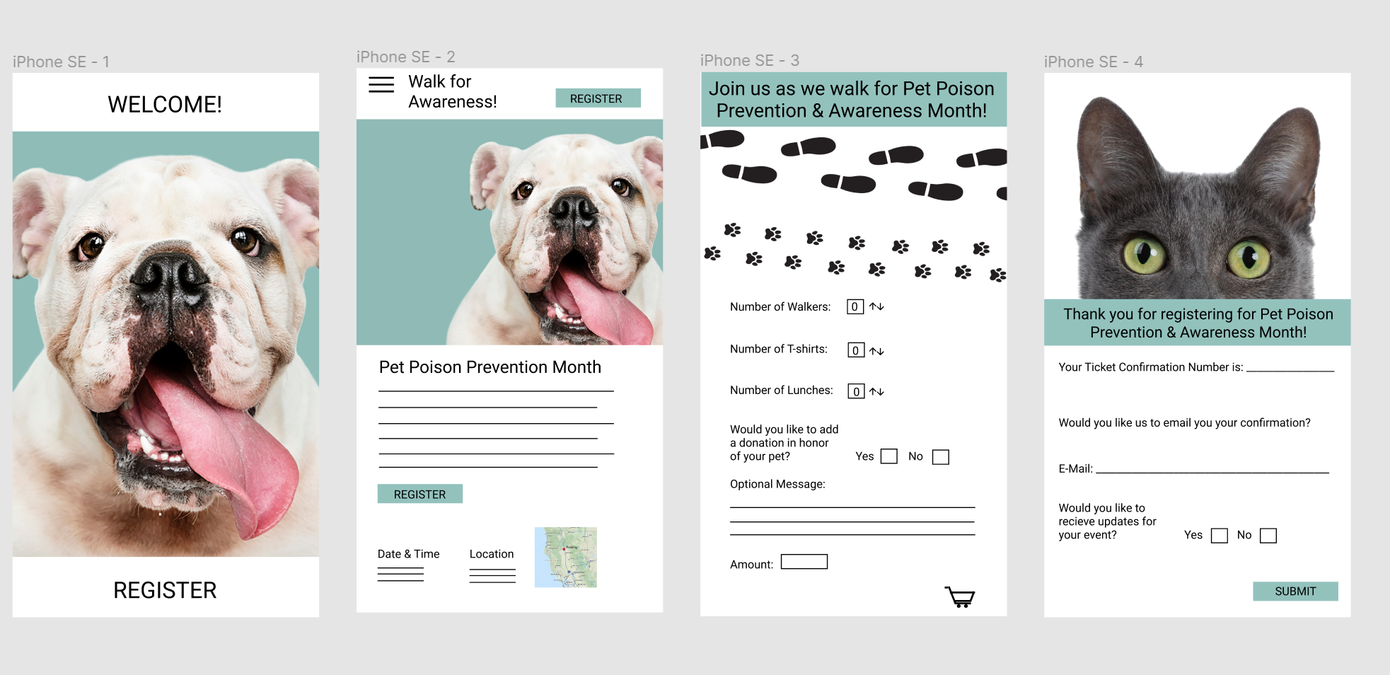
My initial design ideas for an app led me to consider a slightly different approach than the website. For one, I needed a menu bar this time, special attention to detail in the placement of features, and the way the app would look while presented on a phone, ensuring a seamless user experience. It was important to me to keep scrolling to a minimum and, at the same time, not overcrowd the screen on any given page, maintaining a balance between providing sufficient information and ensuring ease of navigation.
Wireframes.
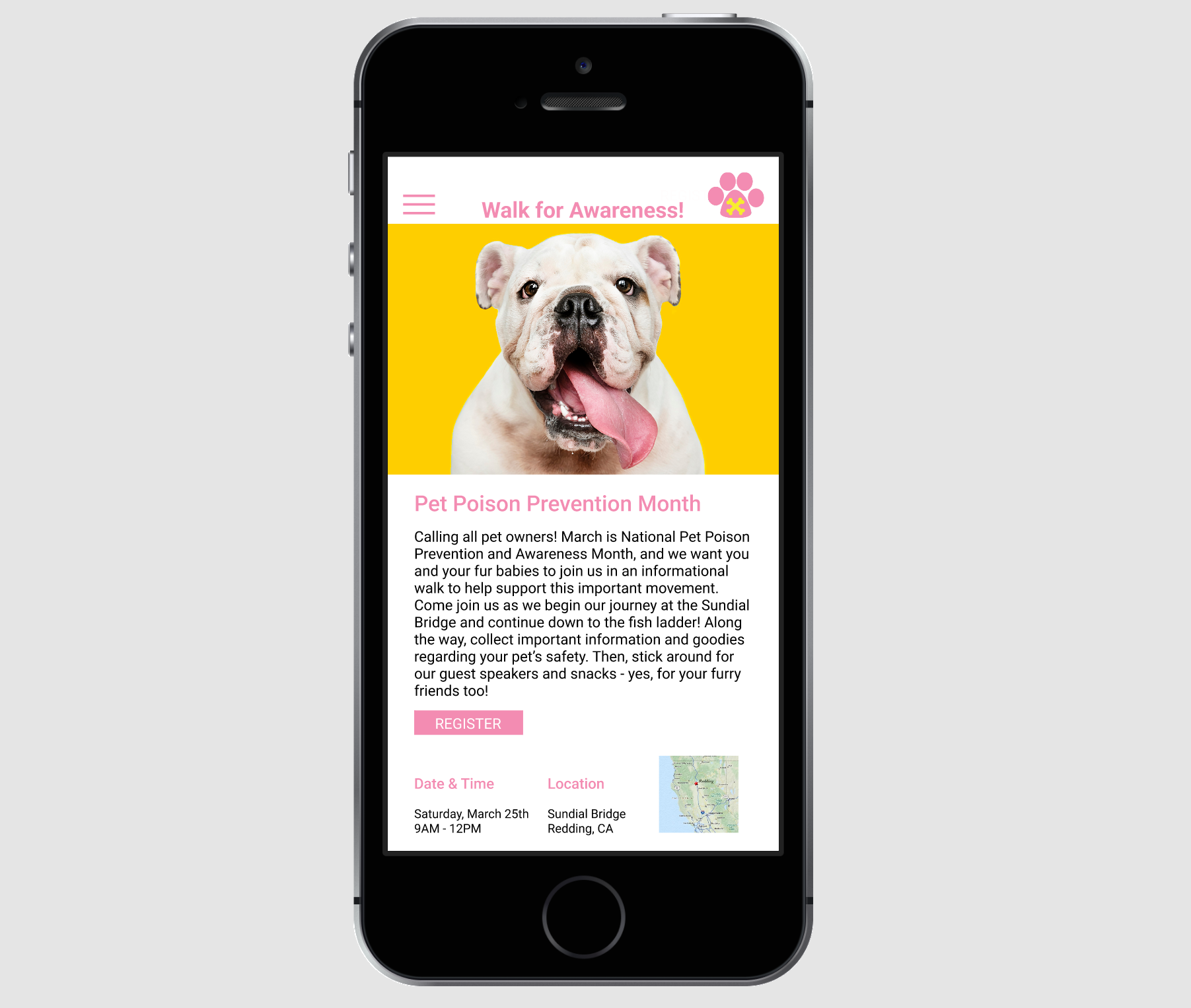
After carefully analyzing the results of user testing for the website, I found myself contemplating the necessity of having a mobile version of the platform. I delved into conducting extensive user testing and actively sought the opinions of our users, and the unanimous consensus was a resounding yes. Without exception, all the testers expressed their inclination to register using their mobile devices, particularly when discovering the site through social media platforms such as Instagram or Facebook.
Data & Research.
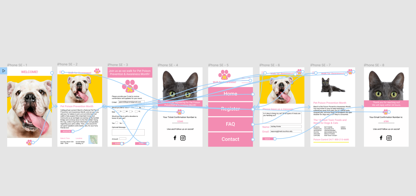
With a few additional screens added, such as the navigation menu, contact page, and FAQ, I decided it was time to begin connecting the dots and enhancing the user experience. Here, you can see how I carefully mapped out where each of the various buttons would lead to, ensuring a seamless and intuitive navigation flow for our visitors.
Figma Prototyping.
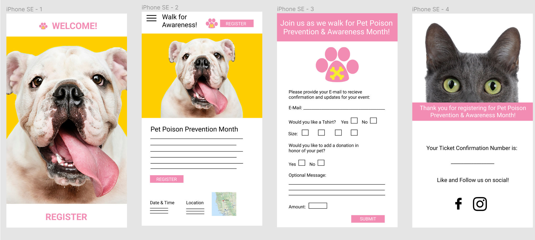
I had a realization that despite maintaining consistent images and logos across the website and printed materials, ensuring uniformity in colors would strengthen the cohesion not only among the screenshots but also across all the event's media components. This particular screenshot depicts the transition in colors and some subtle re-formatting, marking a significant step towards visual coherence.
Changes.
Maze User Testing
Last, I took my Figma prototype and put it in Maze to conduct prototype user testing.