

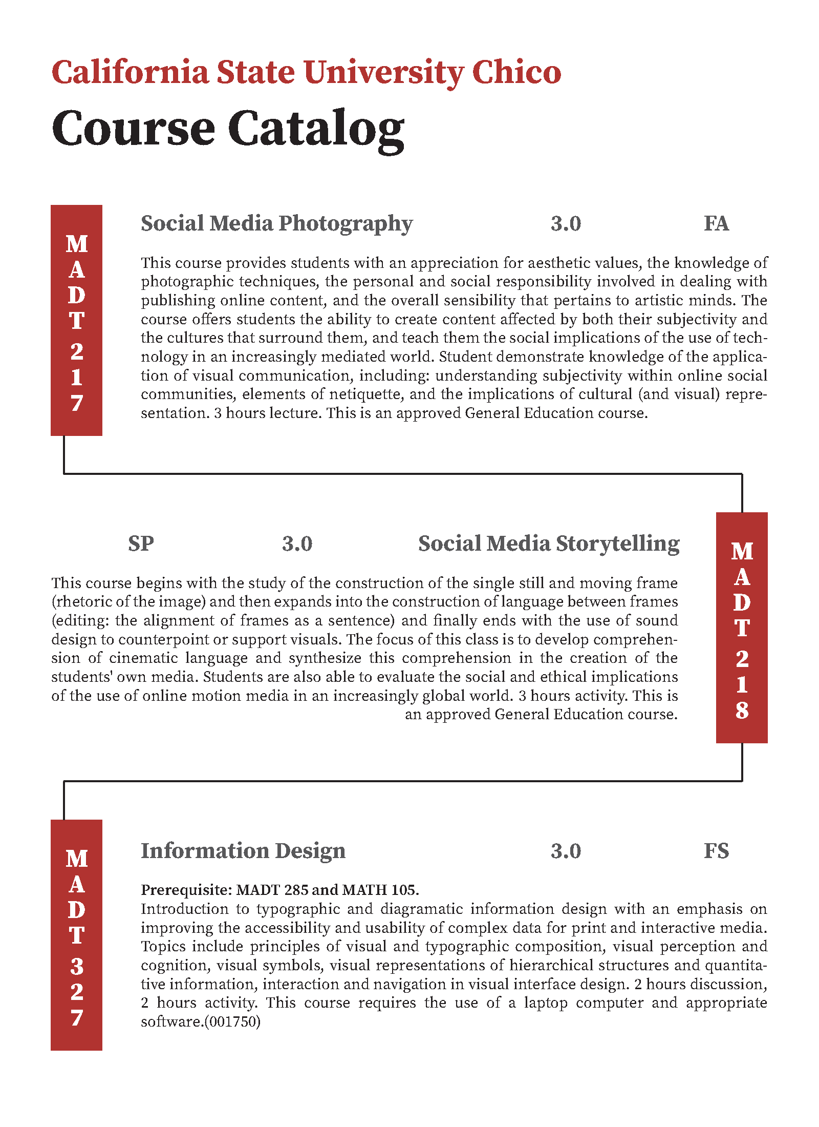
Information Design
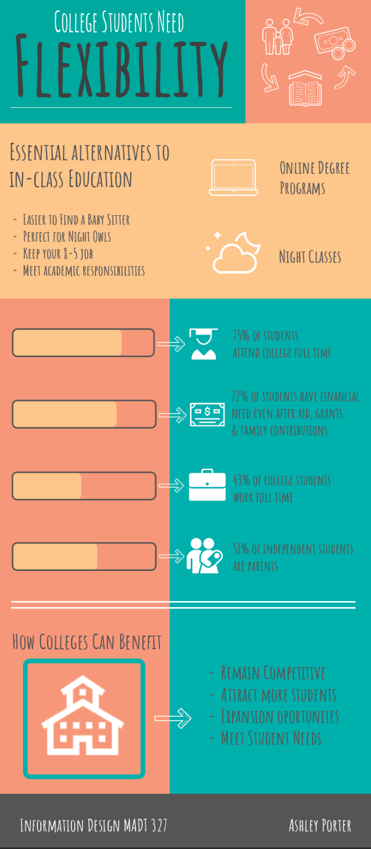
College Students Need Flexibility.
In this information design graphic about college students and flexible learning platforms and options, I aim to visually illustrate the array of choices available to modern students. Through a blend of compelling graphics, and concise data, I highlight the various flexible learning opportunities such as online courses, hybrid programs, and adaptive scheduling. By incorporating eye-catching infographics and pertinent statistics, the graphic will underscore the growing demand for versatile education models among college students. Furthermore, I utilized dynamic visuals to elucidate the benefits and challenges of these different learning pathways, offering a holistic view of the evolving educational landscape for learners.
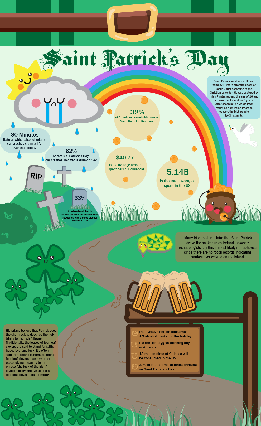
Saint Patrick’s Day.
Saint Patrick's Day Infographic: Irish Heritage and Today
This vibrant and engaging infographic aims to transport you to the heart of Saint Patrick's Day celebrations, while not always sunshine and rainbows. Set on a backdrop of lush green, the design draws inspiration from the iconic landscapes of Ireland. The infographic showcases the story of Saint Patrick and the good, bad, and ugly surrounding the holiday.
Embedded within the design are delightful illustrations of shamrocks, the belt of a leprechaun, and overflowing mugs of ale, accompanied by intriguing facts about Irish folklore, current statistics, and fun facts. With its lively color palette and compelling narrative, this infographic invites viewers to immerse themselves in the spirited traditions and fascinating history of Saint Patrick's Day.
Event Poster.
This typographic event poster for the 2022 music symposium was meticulously designed to capture the essence of the event. Employing a sleek and modern aesthetic, I incorporated dynamic typography to underscore the symposium's innovative approach to music. The bold use of typefaces and contrasting colors conveyed the vitality and diversity of the musical rhythm. By skillfully arranging the text and integrating musical elements into the design, the poster served as a visual introduction to the symposium's theme and invited attendees to immerse themselves in a world of musical exploration. The design not only piques curiosity but also sets the tone for a vibrant and intellectually stimulating event.


DIY Groups.
Designing an information graphic about the relationship between DIY groups and projects and mental health involved a deliberate approach to visually represent complex data in a clear and concise manner. By incorporating color schemes that are easy on the eyes and utilizing simple yet effective icons to symbolize key concepts, the graphic communicates the positive impact of engaging in DIY activities on mental well-being. The layout was strategically structured to guide the viewer through the information seamlessly, highlighting statistics and quotes that support the correlation between participation in DIY groups and improved mental health. Overall, the design aims to present a balanced view of the subject matter, allowing viewers to draw their conclusions while being informed and engaged with the content.
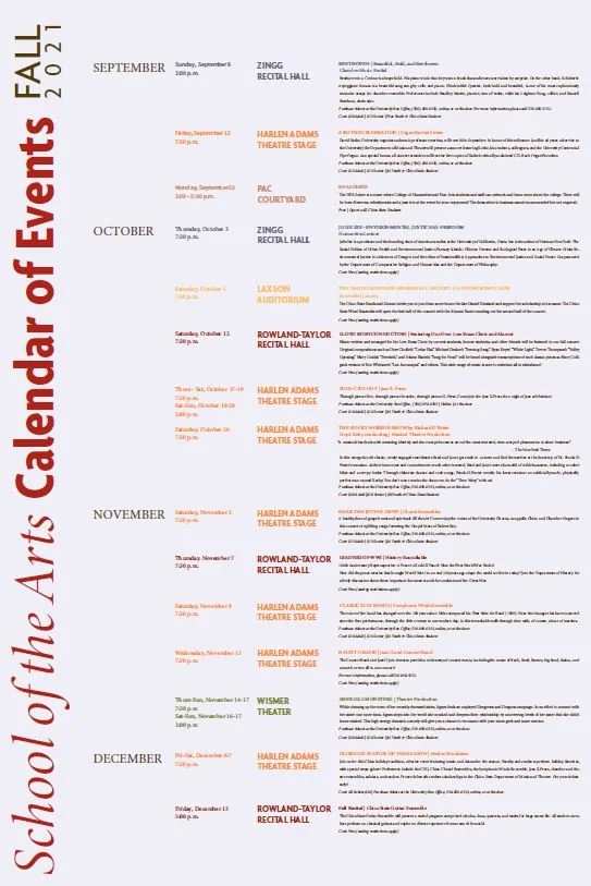
Event Calendar.
For this event calendar, I focused on creating a visually engaging and user-friendly design that effectively showcased the diverse range of artistic events and performances taking place throughout the semester. I implemented a clean and modern layout that balanced aesthetic appeal with practicality, ensuring that students, faculty, and community members could easily access and navigate the calendar. Emphasizing the importance of clear event details and intuitive navigation, I incorporated color-coded categories and a typographical system. By prioritizing functionality and aesthetics, I aimed to enhance the overall experience of discovering and participating in the vibrant arts scene at the university.


Course Catalog Layout Options.
In the spring of 2021, I had the opportunity to showcase my design expertise by creating four distinct course catalog layout options for Chico State University. Leveraging my passion for clean, modern aesthetics and user-friendly navigation, I meticulously crafted each layout to exude professionalism and academic allure. With a keen focus on enhancing the visual appeal and accessibility of the catalog, I incorporated intuitive color schemes, readable typography, and a seamless information hierarchy.
MOMA Event Poster.
I had the exhilarating task of crafting a vibrant, modern event poster concept for MOMA that truly captured the essence of the event. Infusing a rich blend of bold colors and sleek, contemporary design elements, I aimed to visually convey the dynamic energy and innovation that the event promises. Incorporating playful typography and striking graphics, I sought to spotlight the esteemed event speakers in a way that would resonate with the audience. By skillfully layering color and incorporating visually engaging elements such as speech bubbles and dynamic lines, the poster succeeds in not only introducing the speakers but also creating an enticing and dynamic visual narrative that draws the viewer in. The result is a poster concept that exudes excitement and promises an unforgettable experience at the event.

Theme Park Event Map.
During the festive holiday season at Historic Hawes Farm, I undertook the task of meticulously crafting an intricately detailed event map for their celebrated Christmas gathering known as Lights on the Farm. To commence this undertaking, I embarked on an exploratory walk throughout the event grounds, dedicating time to precisely sketching and capturing the essence of the picturesque landscape. Subsequently, utilizing my artistic prowess in Adobe Illustrator, I set about conceptualizing and creating unique icons to represent each distinct location within the farm. As the project progressed, my focus shifted to constructing the map itself, where I crafted footpaths and outlined the various parameters for the diverse areas.
