

Keepsakes book design.
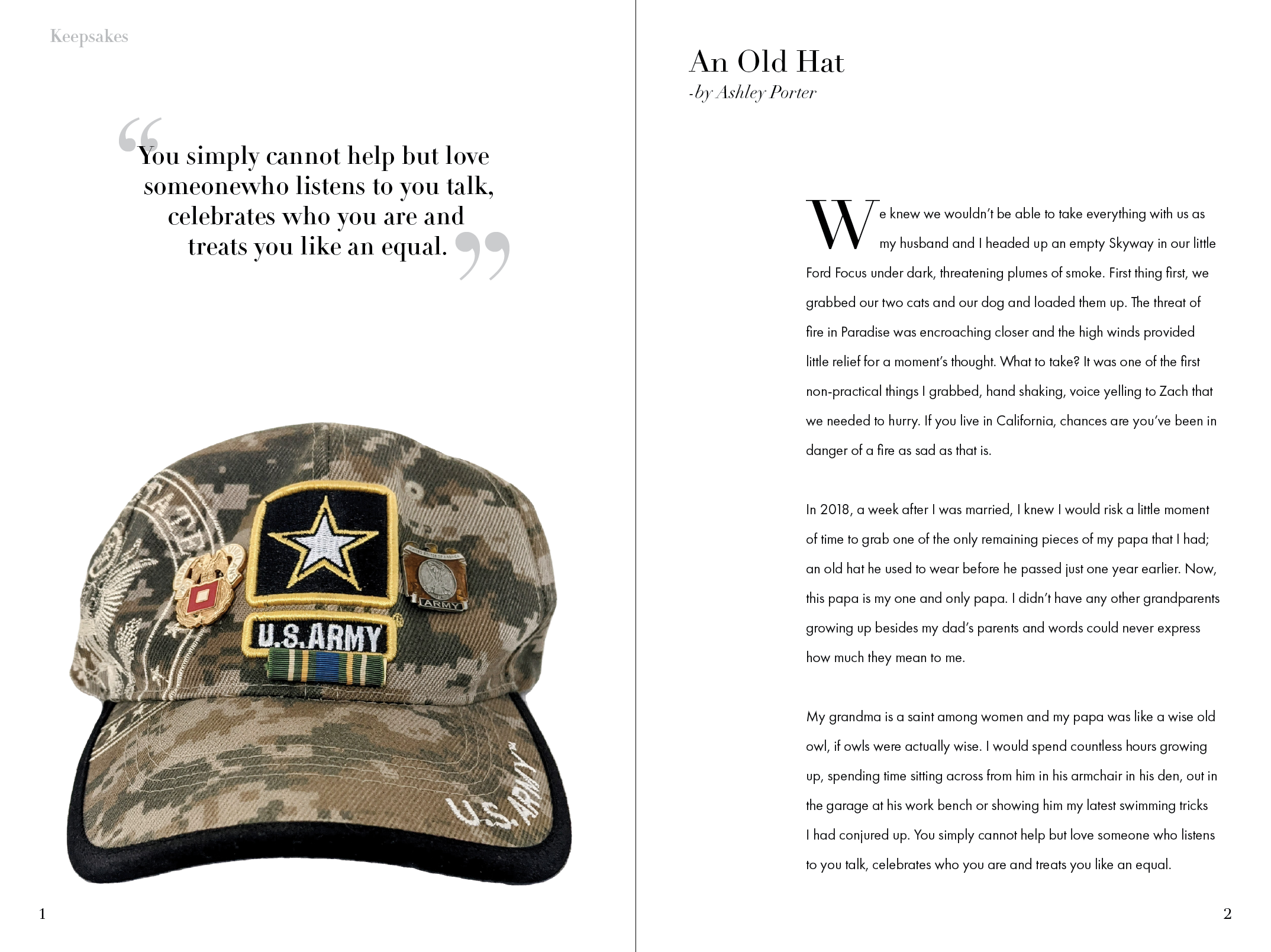
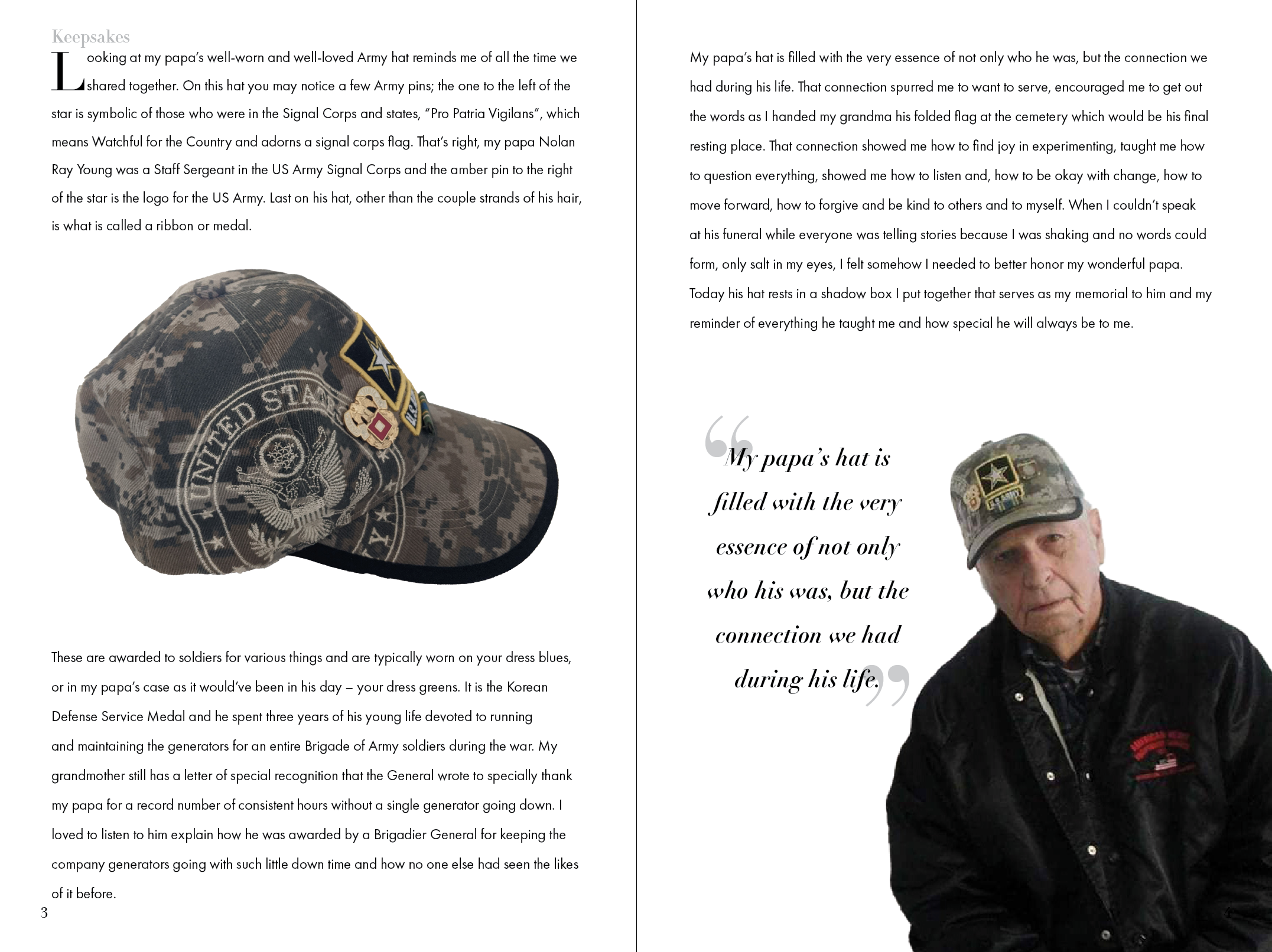
A lot of my team members were asking themselves what they would grab to take with them if they suddenly had to leave everything they had or what items had they toted around for years from place to place. In 2018 my husband and I experienced what it would be like to have a few moments to grab what was important and leave in the Camp Fire in Paradise, CA. One of the most important things I own is a hat that my papa, Nolan Young, wore and was given to me after he passed away in 2017. We were close and had a military connection that I didn’t have with any other family members so I chose to photograph his old hat and write about why I keep it for my part of the book pages.

What do I keep?
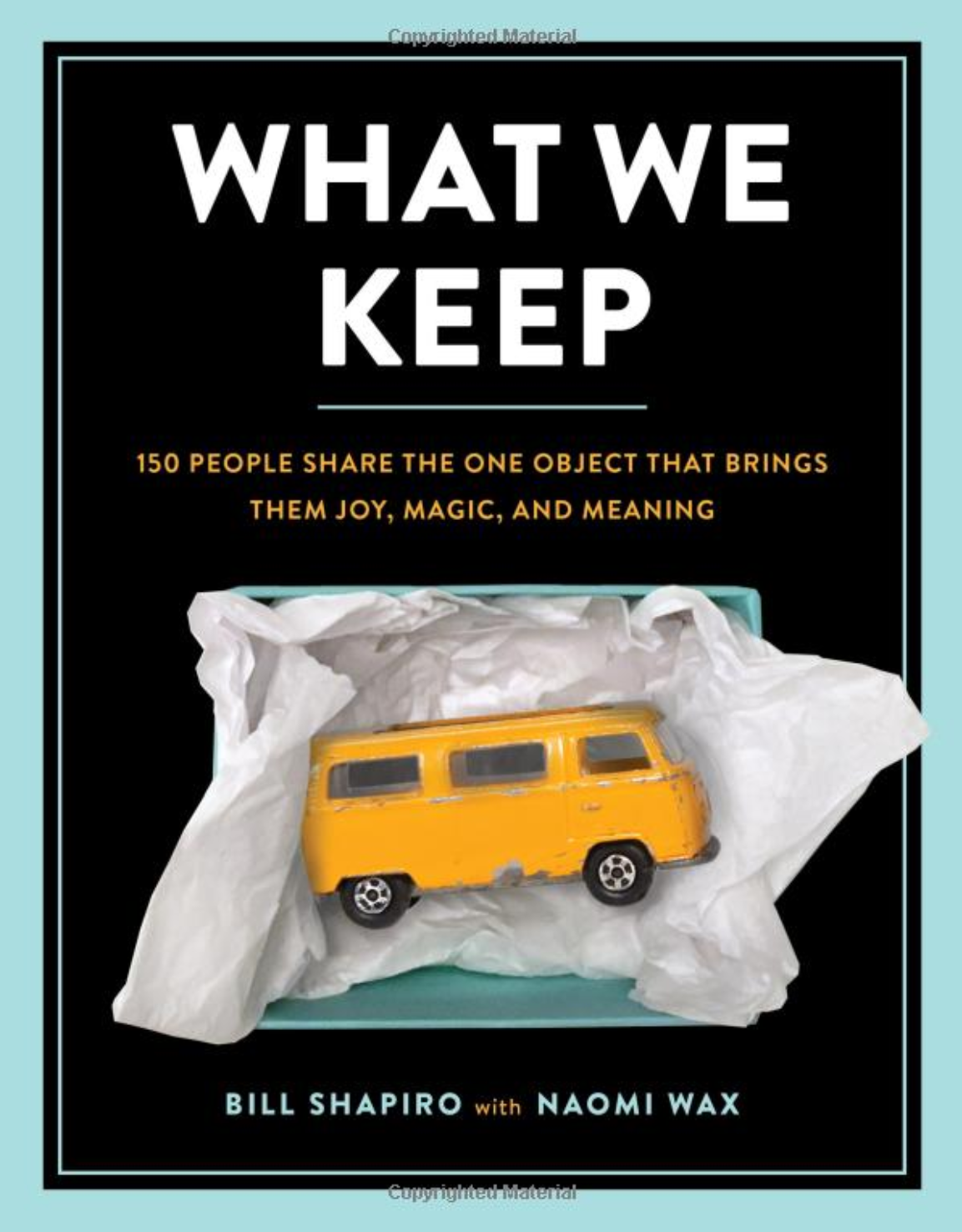
For this project, I worked with a team to redesign a book based on the premise of "What We Keep" by Bill Shapiro and Naomi Wax. I redesigned the cover, added pages featuring my items, and incorporated photos and stories from my teammates. Then, I formatted everything into the book using my layout designs.
What we keep.
For my project, a few of my team members contributed stories of stuffed animals. I liked the idea of a stuffed animal because it feels cozy and sentimental. Instead of favoring one item, I chose to license a stock photo of a stuffed bear from Adobe Photostock. I edited the photo in Photoshop to give it a calm, comfortable blue hue. Then, I turned the bear into a faded sketch and placed it inside the back flap of the jacket to tie the inside and outside together. I named the project "Keepsakes" to convey the deep value of the stories behind the items.
At first, I spent a lot of time thinking about how to put things from different stories on the book cover. I also tried different titles for the book. When considering keeping items, I imagined packing and moving them with me. This made me think of using cardboard for the book cover and writing “keep” as you would on a storage box. I was focused on finding a concept I liked rather than perfecting the grid lines for typography at this point.
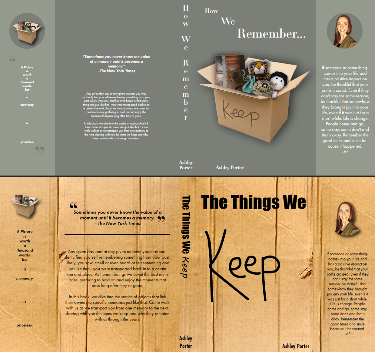
Book jacket ideas.
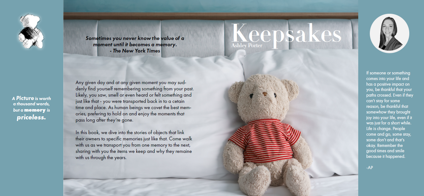
Final book jacket.
For the interior pages, I designed the layout in Adobe Indesign. I chose to use a serif typeface for my headers, sub-headers, and quotes because typefaces that use serifs make me feel nostalgic as they have a certain old-world quality. In particular, I chose the classic Ditot LT Pro typeface. I then paired that with a more readable typeface for the paragraphs, Futura PT book.

Inside Keepsakes.
Working on this project helped me to improve my skills in Adobe Indesign, it allowed me to familiarize myself with publishing a book through an online company called Blurb, and I also gained a great deal of knowledge in regard to the different parts of a book. I learned about front matter, back matter, how to write a colophon, and where that derived from. I was able to hone my typography skills and work on my grid use as well. What were challenges and unknowns became wins and lessons learned. Please feel free to take a moment and view a PDF of the full book by clicking on the link below.