

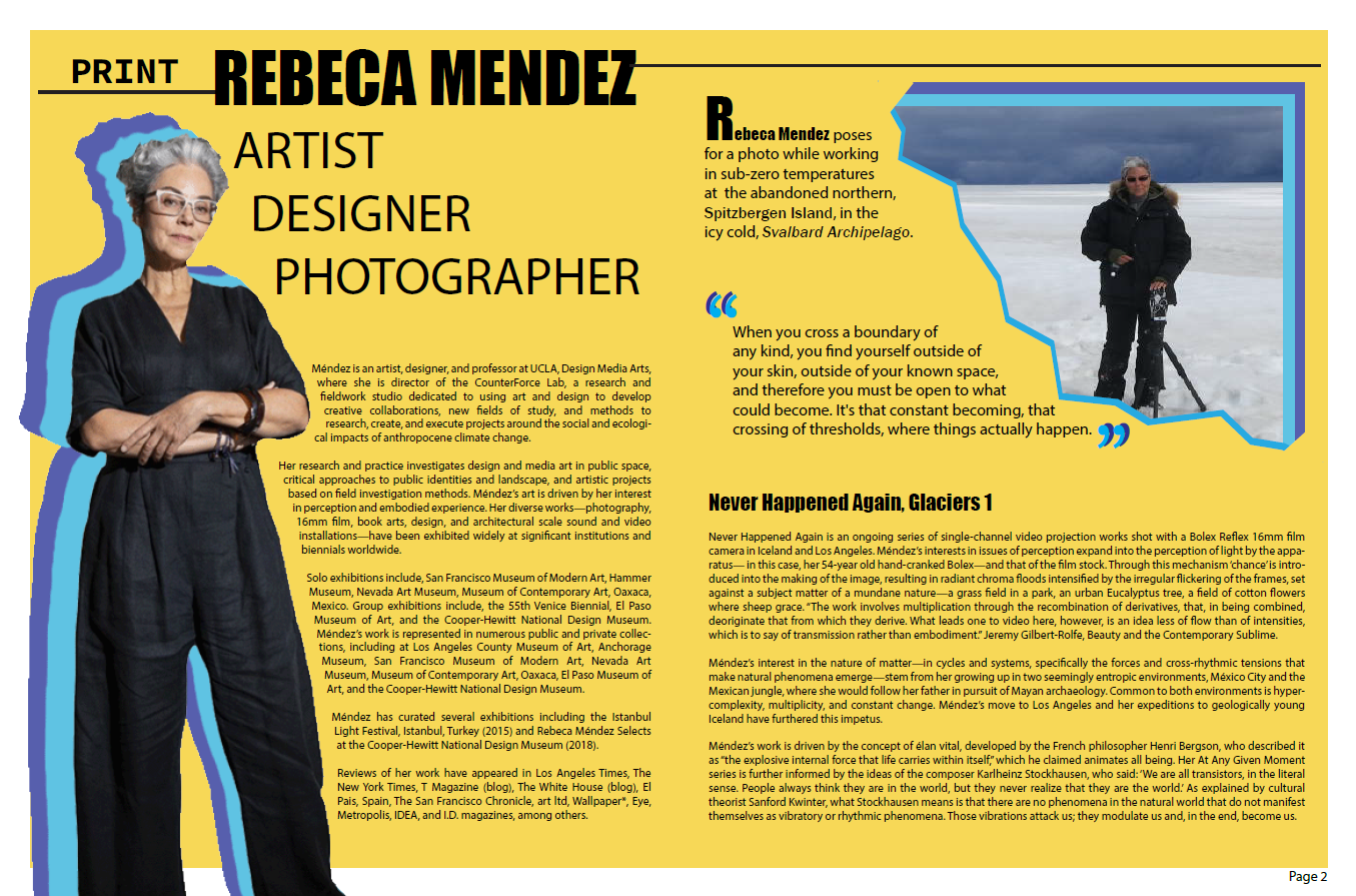
Magazine Spread.
Going into this project I knew that the focus needed to be clear and the hierarchy needed to emphasize Rebeca. Mocked up for a magazine company called Print, I designed this first spread to highlight her name and then draw attention down the page. Following the outline of her image, the viewer is then naturally guided down the page and back up to the heavy ‘R’ to begin again on the next page. While this spread is text-heavy, I was able to break it up with imagery and one long quote to give the viewer a reprieve from the many paragraphs of information. I chose four colors; black, light blue, dark blue, and a contrasting yellow.
Designing for Mendez.
For this project, I chose to do a four-page spread on artist Rebeca Mendez. Rebeca Méndez is a Mexican-American artist and graphic designer. She is a professor at UCLA Design Media Arts in Los Angeles, California, and since July 2020 is Chair of the Department, as well as founder and director of the Counterforce Lab. Her life and work stand as a testament to defying the conventions of graphic design and graphic media fields and expanding the definition of what it means to be a working artist and designer. She has forged her path through punishingly uncharted terrain that’s taken her to the arctic tundras of the earth’s poles, as well as many untamed territories. How could I not choose this 2017 AIGA medalist as my subject of focus?

Rebeca Mendez.
One project to highlight.
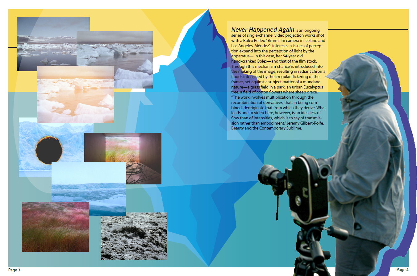
I chose to focus on her Never Happened Again project which is an ongoing series of single-channel video projection works shot with a Bolex Reflex 16mm film camera in Iceland and Los Angeles. This project played a role in my color pallet choices since much of the filming took place in Iceland and around glaciers and icebergs. I designed an iceberg image that would both help to separate and unify both sides of the spread as well as communicate more about the project.
First, I draw the viewer’s eye to the images on the left, then up the image of Mendez with her camera to the text frame where the viewer is then led back down to Mendez and the camera pointed back at the images. I think this layout provides interest with contrast and repetition as well as leading lines. If I were to change one thing about this spread, I would either move the ice burg further to the left or up the opacity of the white text background to help with readability.

