

Mother’s Aid Hard Candies.

Research & Ideation.
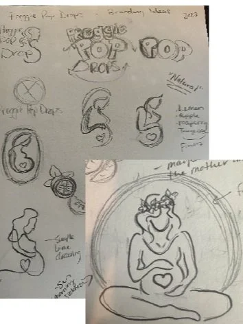
For this project, I chose a random product on the market to redesign the branding for. Preggie Pop Drops are basically hard candies that help pregnant women cope with morning sickness symptoms. This logo seemed archaic in the design mainly due to the background image. It was clear that they wanted to include a lot of information on the main graphic, but I knew there had to be a better way to accomplish that. Also, while I think the name of the product is cute, when I asked others what they thought the product was, no one was quite certain.
To the Drawing Board.
First, I began with sketches re-working the current name and logo “Preggie Pop Drops” but I found that I wanted to connect the logo more to pregnant women in order to help bridge the understanding of what the product is and who it is for. When I think of pregnant mothers, I think of baby bumps and natural curvilinear shapes and so I wanted to reflect those lines in my logo. Ultimately, I ended up going with the enlarged image to the bottom right as my starting point because it is organic and because I placed the heart in her stomach, I feel that it could represent taking care of mom’s health and also baby.
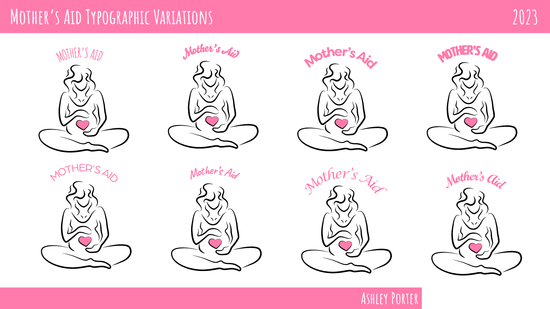
Typographic Variations.
Next, I applied several different typefaces which I thought could work for the logo. I was looking for a typeface that appeared organic and found that I was more attracted to my first type choice in the upper left. While the cursive type looked pretty and had a feminine touch, I found that it looked a little off when curved and also might not be as readable.

Logo Variations.
In order to decide on the best placement and elements to include in the logo design, I played with adding an organic circle around the mother figure. I also adjusted the weights, considering how each would look in larger and smaller formats. On the bottom row, I also chose to experiment with simplified versions of the logo.

Logo System Ideation.
Next, I started to play around with colors as well as what a smaller version of the logo would look like. The smaller version could be used for mail or favicons and anywhere it might be difficult to see the lines of the full logo when sized down.

Final Logo.
Ultimately, I decided to adjust the name one more time to Mother’s Aid Hard Candies. For this final logo graphic, I added in the flavors, tagline, and information that stood out about the product. To the right of the main logo is the smaller, more simplified version for use cases that would require a less involved logo.