

New Life Fashion: Website UX/UI Design
Research
I was tasked with developing a brand and crafting a website for an imaginary clothing revitalization enterprise. To begin, I carefully assessed the services that similar companies aimed to provide, enabling me to better structure the website accordingly. Subsequently, I conducted a comprehensive review of analogous businesses operating online, discerning the navigational and visual elements that proved to be successful as well as those that fell short.
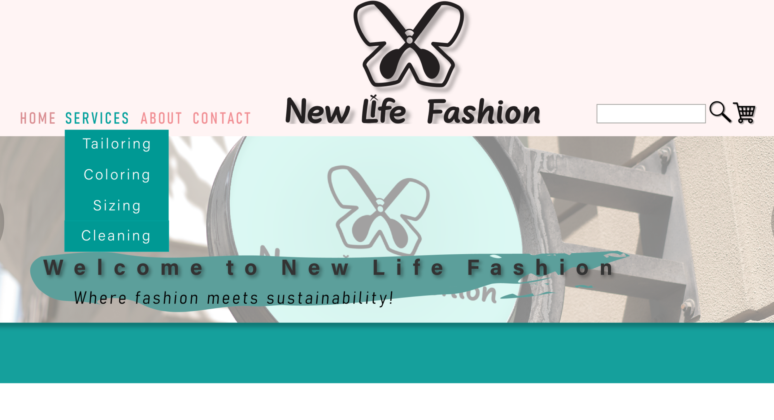
After careful consideration, I opted for a clean and uncomplicated design approach. As a final step, I diligently sourced and categorized a plethora of images, meticulously organizing them into distinct groups to enrich the visual appeal of the website.
User Persona.
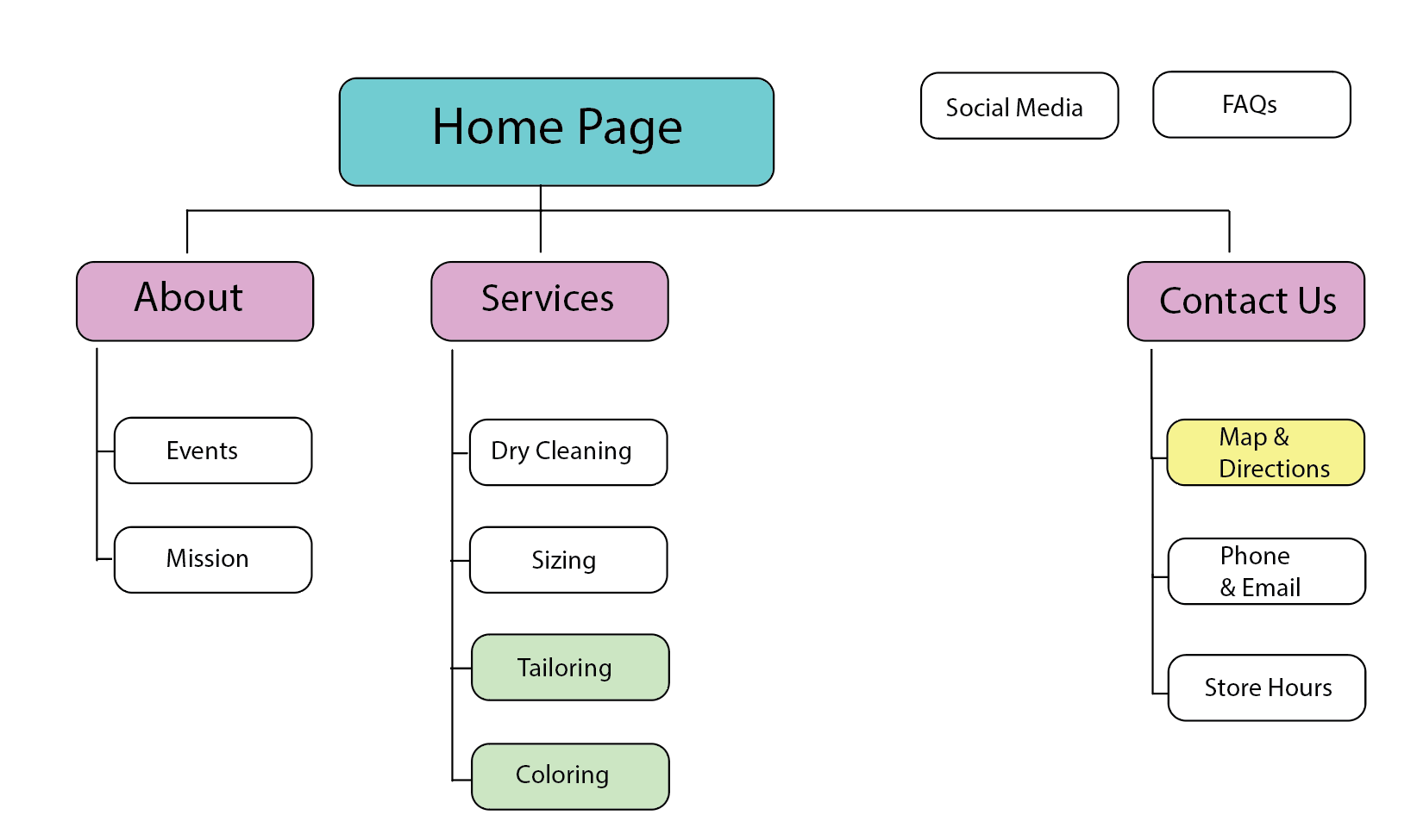
Once I had a clear understanding of the essential services and key information that had to be integrated, I embarked on the task of sketching out detailed flow charts to visually illustrate the system's functionality. The resulting information architecture layout provides a comprehensive depiction of the 1st and 2nd tiers, offering a roadmap for the seamless organization and accessibility of critical data and services.
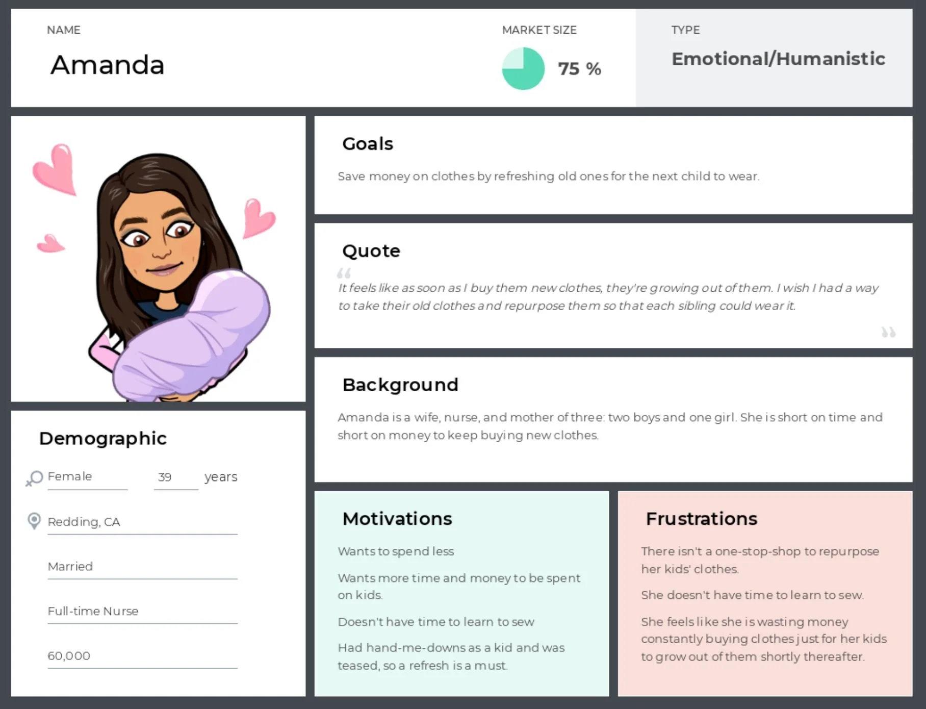
It was crucial to thoroughly grasp the diverse range of users who would be interacting with the website. To guarantee a seamless and intuitive layout, I empathetically immersed myself in the experience of a regular customer, probing and exploring from their unique vantage point.
Navigation Map.
After designing my website pages in Adobe InDesign, I saved them as PDFs to upload to Marvel and make a mockup. Creating the mockup helped me visualize the navigation and do user testing, which showed me how users would navigate the pages. This led to some changes in the top navigation and the addition of breadcrumbs for better user understanding.

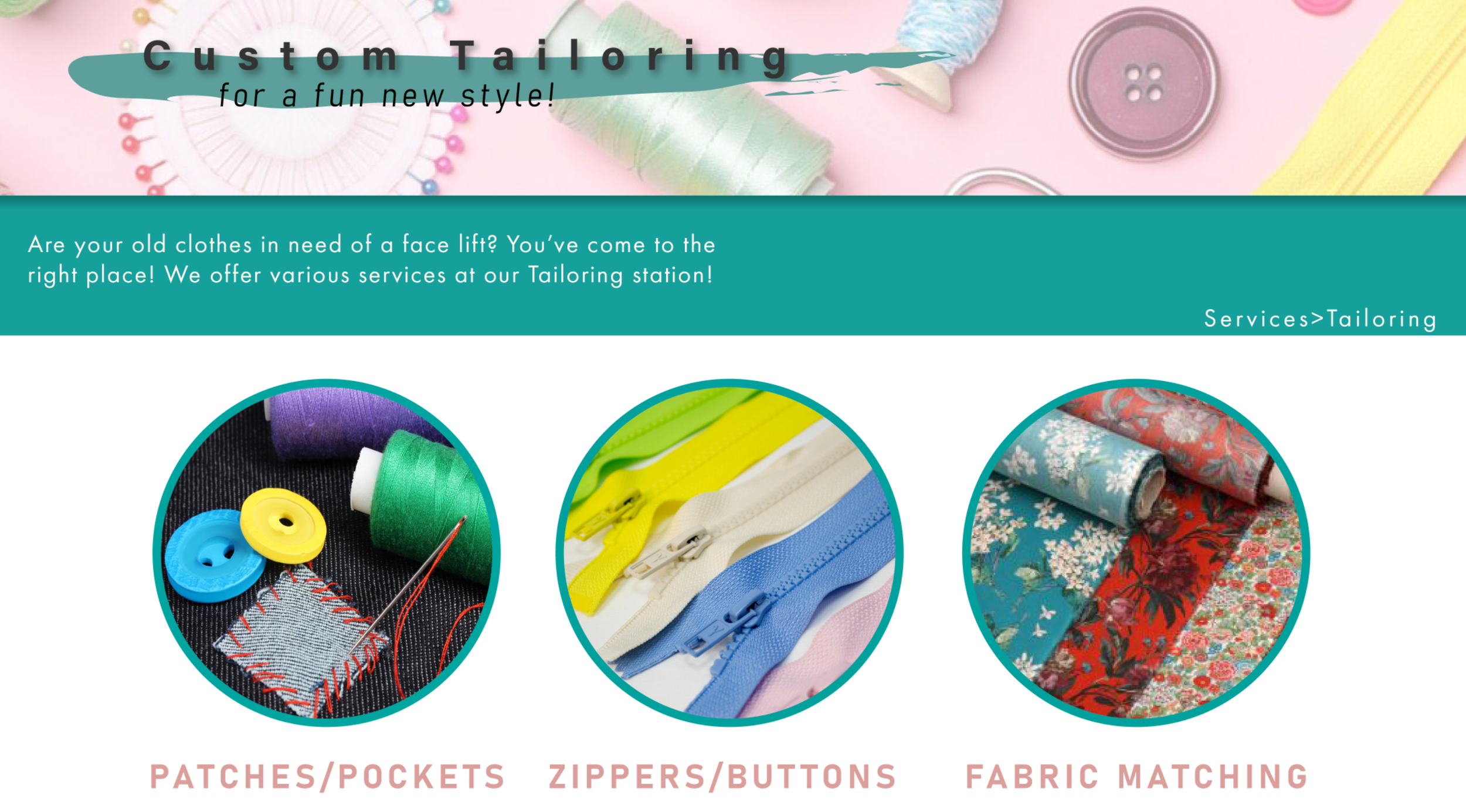
This is a tier 2 example of the tailoring page which has a systemic feel as well as a new type of navigation introduced as you scroll further down the page. The links here resemble the buttons and help to identify the page they link to with imagery and text.
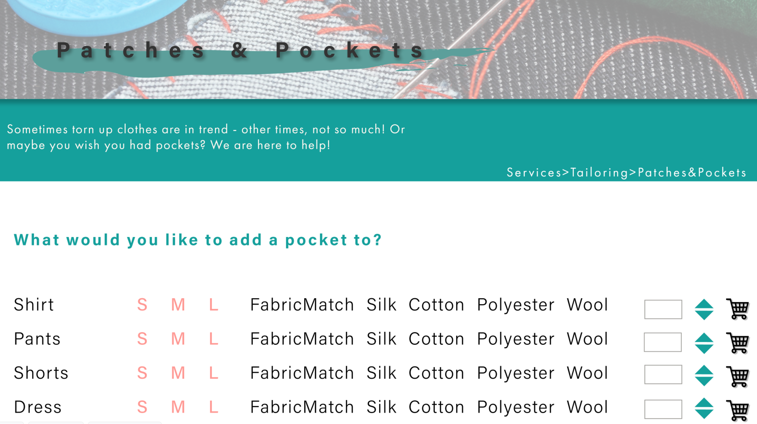
Here, I designed a simple approach to how the user would go about adding a pocket to their piece of clothing.
-
Challenges
During this project, I learned about a new tool for prototyping called Marvel. Through trial and error and after a few mistakes on how to make the navigation function, I was able to come up with a working prototype for my website. Another challenge I faced was including a mobile-friendly version of the website while maintaining consistency in the design layout. Ultimately, I was able to create a systemic feel across both versions.

-
Learnings
I learned that when designing for the web, designers benefit greatly from implementing mobile versions as well. Many users will access websites from their phones or tablets and so it is important that your site be able to react to the different sizes of screens on which it will be displaying. I also learned that prototyping tools are great for feedback and usability testing, but to also test often and prior to going live.
