Undo Your Mind.
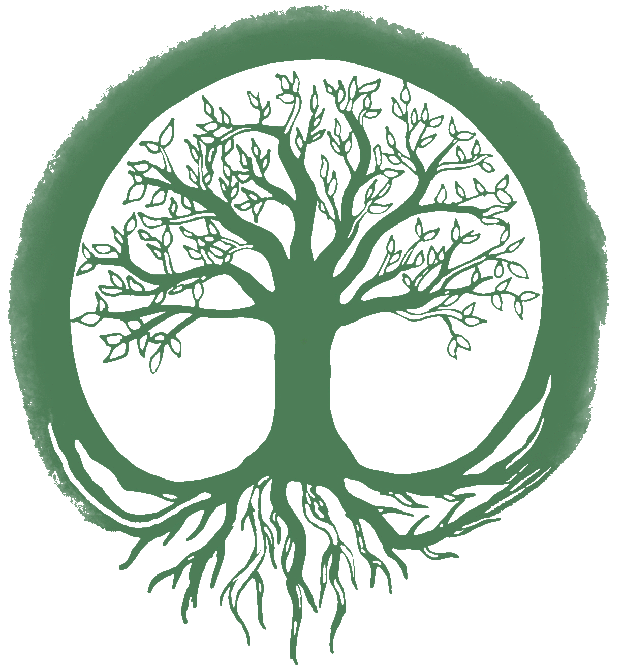
Brainstorming ideas of peace, nature, and zen led me to hone in on a few ideas for a logo design. Here you can see some sketches I drew up around the idea of yin and yang, balance symbolism, nature, and grounding. I wanted to use elements of continuity and contrast in my design to help emphasize an organic look. Ultimately, the client wanted to go with the tree of life in forest green color.

Development.
A client reached out to me and required a logo for their website and social media accounts. I discovered that they work as a Shaman, Usui Reiki Master, and life coach and that they wanted an organic logo centered on the construct of mindfulness and connecting with nature. It was highlighted that they wanted their logo to have natural colors and shapes.

A Business of the mind.
Ultimately, the client chose an organic dark green to fill both the tree and the circular shape surrounding it. This logo feels successful in its contrast and unified composition. The white space helps to break up the circular shape of the tree and the roots remind the viewer that to be like a tree is to be grounded. It was important to the client to convey a message in the logo design and I think that was achieved. I believe that I hit all of the client’s goals as well and succeeded in going a little further with the design by putting a unique twist on a relatively common symbol.
Final Logo.
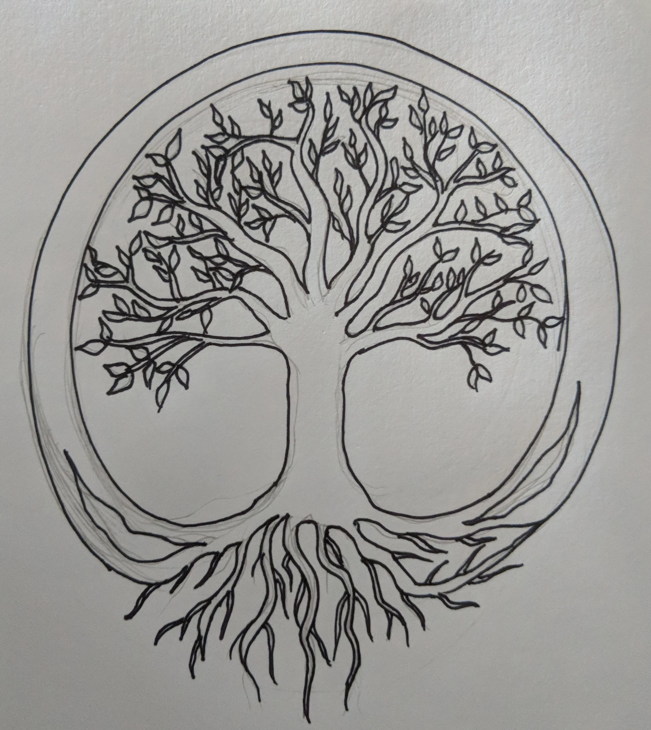
After meeting up with the client again, I had the impression that the tree of life they wanted was much grander in scale. I drew up another tree, this time with roots. After receiving further feedback, they wanted the tree to have a circle around it but for the circle to have an organic nature as well. Finally, we decided to move forward with developing this sketch further in Adobe Illustrator.