

Sustainable Design & Packaging


Research & Ideation.
During early pregnancy, many women seek aid to help alleviate symptoms of sickness. Preggie Pop Drops are one example of a solution to morning sickness, however, the packaging for this product is made of plastic from the container to the wrappers. I decided to redesign the packaging to be more sustainable, not only to help the environment but to also better align the packaging with the all-natural promise of the product.
First, I started by listing prominent adjectives which best described the product and ideas for direction. Next, I began to sketch different ways of making the packaging multi-purpose. Ultimately, I decided that a similar cylindrical container, made from a sustainable compound, would work best. From there I developed an idea to create a baby mobile design that could be cut out of the packaging and assembled for use.


Digital Rendering.
Using Adobe Illustrator, I created a mockup design for the mobile and what it would look like fully assembled. The texture of the design indicates that the material is made of cardboard. The dashed lines are implied corrugated marks to make cutting the mobile pieces easier. For the coloring used, I would advocate for soy-based ink. Soy ink is made from soybeans. Compared to traditional petroleum-based ink, soy-based ink is accepted as more environmentally friendly. I also considered how the mobile pieces would be attached to the container lid, and I considered that either the person who purchased the product could supply the string, or included inside could be strands of twine string made of natural, biodegradable material.
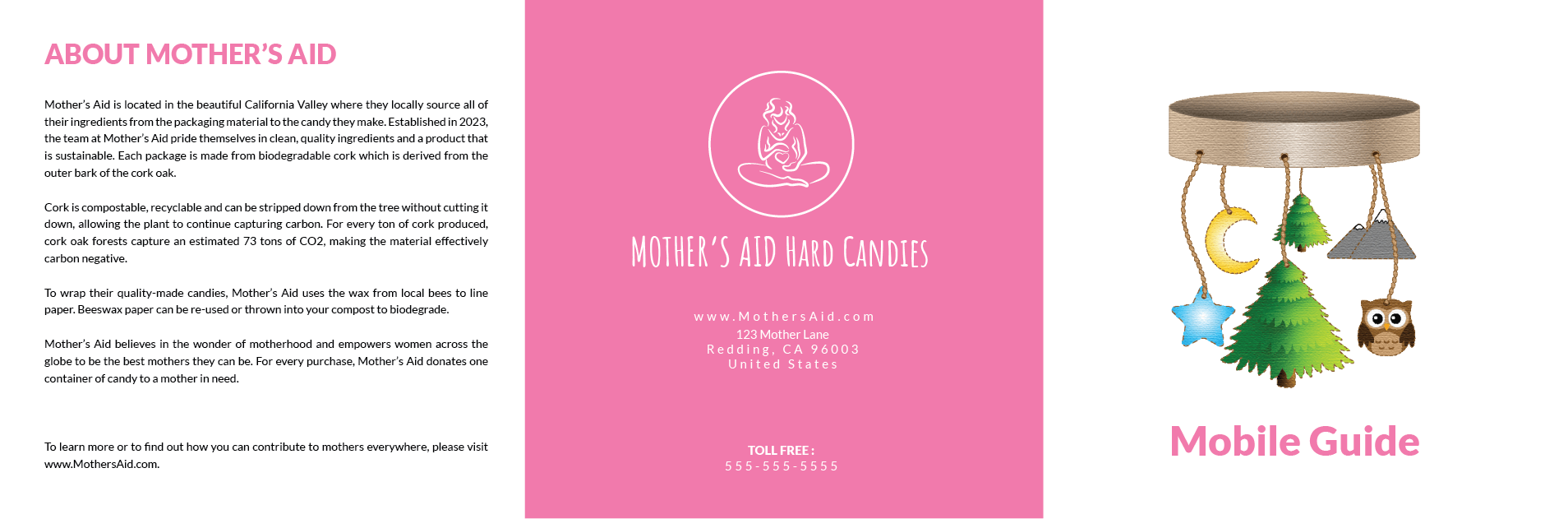

Instructional Insert.
Next, in order to help the purchaser understand how to assemble the mobile from the product packaging, I designed an instructional insert/pamphlet to be included in the product container. Using Adobe Indesign, I compiled a front and back, 6-page guide, and for the purpose of this insert, added a section stating that string and scissors will be needed to complete assembly.
Container Design.
Using Adobe Dimension, I created a 3D image showing various angles of the container. You can see that the lid would pop off and has lines indicating holes that you can either cut or punch out for the string to tie to. For more insight into how I composed the branding for the package, please visit the BRANDING page.


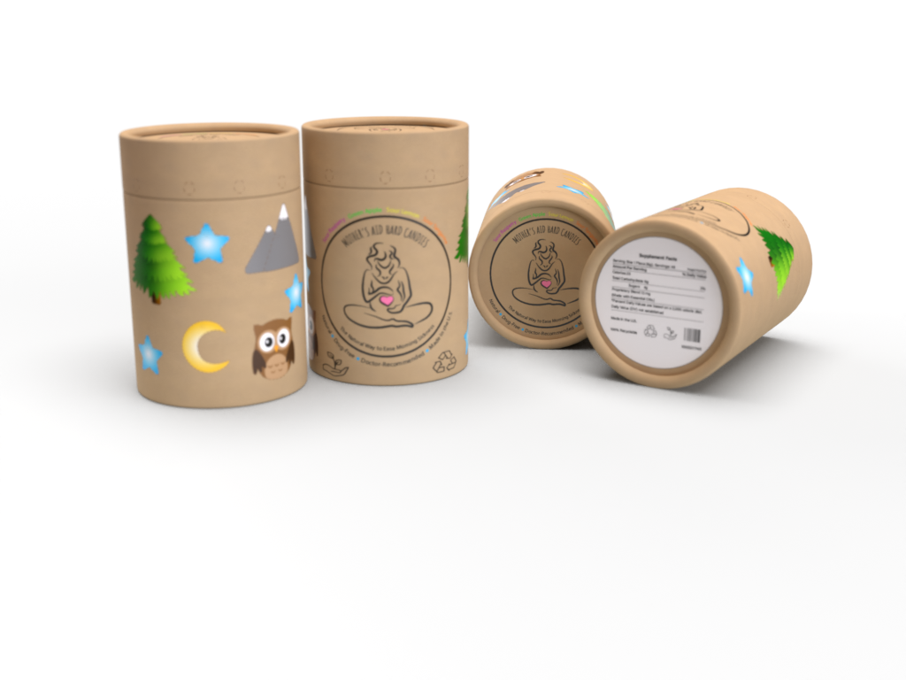
Final Container Design.
Here you can see my completed final redesigned container used in an advertisement as well as a display of all the pieces. I decided that a type of cork with a high density would be a better choice than cardboard because it’s more sustainable and also more durable. Note also that the original container also had the candies wrapped in plastic while I aim to show a better option using wax paper instead. In a perfect world, I would love to see the company that makes these have a donation aspect where for every 1 purchased, 1 is donated to a mother in need in a third-world country.
To learn more about the original product, please visit their website HERE.